Do you enjoy staring at old maps?
The University of Richmond has produced a digital and interactive version of Charles Paullin and John K. Wright’s Atlas of the Historical Geography of the United States, originally published in 1932. You can find it here: http://dsl.richmond.edu/historicalatlas/ This is a broad collection of maps – it includes information on demographics, military campaigns, ecology, transportation, and more.
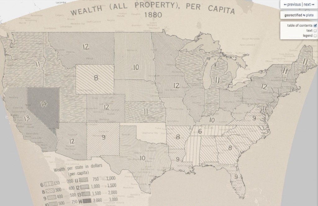
We know that old maps are interesting, but what makes them useful? Maps can raise historical questions, like “Why did Nevada have the highest per-capita wealth in 1880?”
Maps can also answer our questions
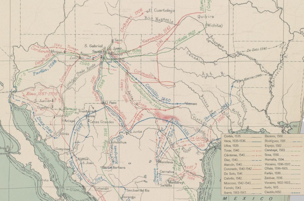
Many historical accounts of human movements, including migrations and military maneuvers, only come to life when we see a picture of the earth that they moved across. We can describe the routes of 17th century Spanish explorers in the American southwest, but until we see a map of their explorations we will not have a full understanding of how much territory they covered. (Of course, once we see the map we may have new questions, and the process comes full-circle.)
Maps affect our view of the world
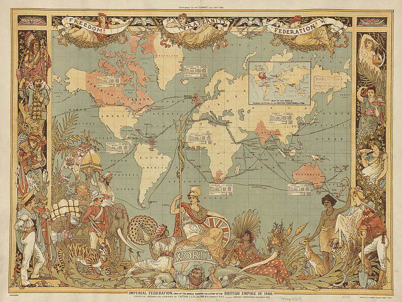
The maps we use are oriented in a certain way, for instance. For Westerners, maps usually have North at the top, while ancient Mediterranean maps were oriented with East at the top. This can cause us to perceive one place as more important, more accessible, or more desirable than another. Sometimes, maps are a product of the way we see the world (and this is particularly useful for historians, who can learn about the context in which old maps were made).
 (Click the image above to zoom and view details)
What does this map of the British empire reveal about the map makers, and how did the map, in turn, affect the way British Subjects in the late 19th century saw the world? Quite a lot, and I’ll let you ponder that and post comments.
What can we map?
Almost anything – not just geography. The artist Denis Wood showed this in a fascinating way through a multi-decade project in his neighborhood. http://www.attendly.com/these-creative-maps-remind-us-that-neighborhoods-are-alive/
One of the most practical, yet abstract examples of modern map-making can be found on buses and trains all over the world. Metro transit maps affect the everyday life of millions of people, and here is a psychologist’s take on what makes a good subway map: http://www.npr.org/templates/story/story.php?storyId=225023454&sc=tw&cc=share
“What we find (in our research) is there is zero correlation between the objective usability measures and whether people like a map or not.” — Max Roberts
In case you haven’t been totally derailed yet from whatever it was that you were doing before you came to this page, here is another cartography blog that has a wealth of info on maps, how to create them, and how they are useful: http://makingmaps.net/
So, next time you punch an address into Google Maps or get lost in a museum, pause to think about how handy it is to have maps, and thank a cartographer!